

TL;DR
Reconstruct the source of truth. Align across teams.
I led the migration of our design system documentation from static Figma frames to a more accessible platform for better alignment between design and development.
As the project's sole contributor, I worked closely with the CPO, designers, and engineers establishing a structured documentation process through iterative feedback.
Outcome
and deliverables
200% Adoption and Engagement
Improved Design Consistency
Increased Development Efficiency
Scalable Governance
Context
For years, in our product team Slack channel, we constantly have questions like "Do you know if we have rules for this component somewhere?" or "Where can I find the detail about this component?" from both designers and developers. A lot of times the answer is there in our Figma frames.

Pain points
I identified 3 primary issues of the current design system documentation:
Elusive
It was difficult to navigate through a canvas-based design tool to locate relevant information.
With the expanding design system and increasing team size, locating the appropriate reference within Figma frames can be time-consuming.
Inconsistent
The inconsistent explanations and unstructured content within our documentation contribute to the difficulty of finding relevant information. This lack of predictability makes it challenging to locate the desired information, especially when searching for common patterns in component behavior explanations.
Unwieldly
Maintaining extensive text-based content within a design tool can be inefficient.
The challenge
How might we improve the structure of our documentation for better navigation and consistency for all components?
I conducted a comprehensive analysis of prominent design systems such as Material Design, Atlassian, IBM Carbon, Adobe Spectrum, I identified common patterns in content structure and carefully selected the most relevant patterns to incorporate into Block Aero's structure.
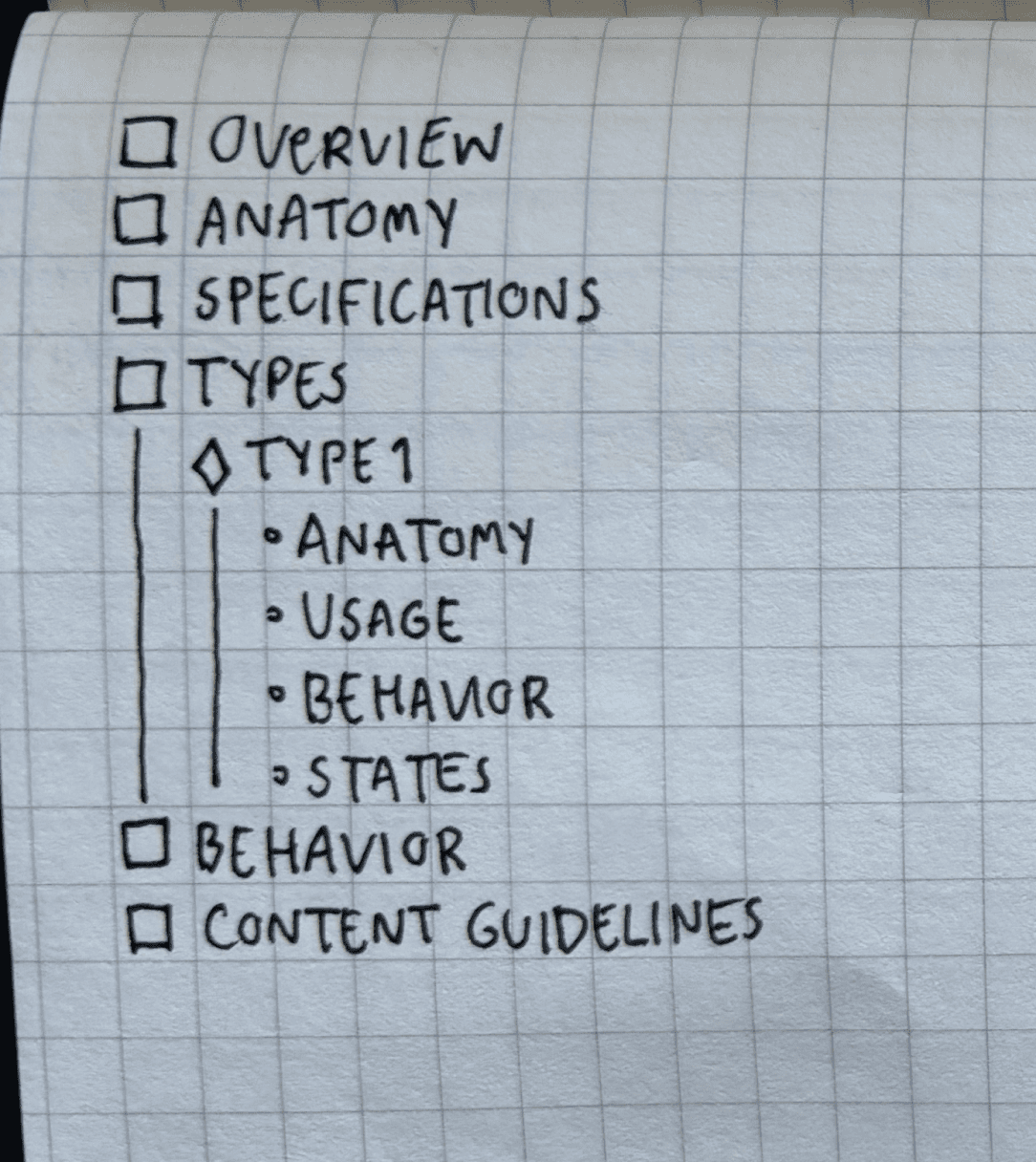
One-Size-Fits-All
Worked well with complex components.
Did not work with simple components. ❌
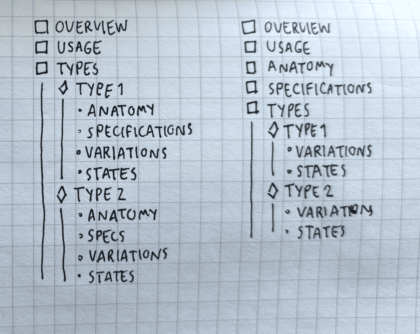
Simplified
While the options seem clear to me, other team members might struggle to decide between the options.
Others might choose the wrong options or mix them incorrectly.
This inconsistency could make the product less user-friendly.

Granular
Too many options, even with guidelines, could lead to confusion.
Templates ✨
Narrow down the content structure options to three templates based on component complexity.
A simplified and effective approach. To align the understanding between designers, I made glossary list of definition too.
Flexibility for growth and improvement
Maintenance of core concept
Simplified design process
Ensured consistency and clarity across the product

Learnings
Context is the key.
Design systems vary widely based on context and complexity. While what works for others may not be directly applicable to another, there are fundamental concepts that can be shared and adapted to create effective design systems tailored to your unique needs.
One-size might not fit all
A simple solution doesn't have to be a one-size-fits-all approach. Iterative testing and simplification can help manage complex documentation projects.
Define shared language
Focus on designing for others, establishing a shared language to foster effective collaboration, clarify any terminologies and naming convention is crucial for cross-functional team.
Clear goals
Having clear goals help you make better decisions and keep the design aligns with the overall objectives.